


If you’re starting out in web design, you’ll want to have the best web design software. You might also want to see our article on more exciting web design trends for 2022.
Home Pages Without Images
No photo? No problem! Design it without images and you’ll be right on trend in 2022.
Use a different type of user interface or design trick to make the most of a home page without images. In the example here Kirifuda uses a beautiful black and white color scheme with an overprint effect between text elements. Oversized typography and a handwriting style typeface help pull it all together. (Note the combining of other design trends into this one for a stellar effect.)
A design without images is also a great opportunity to try other techniques as well, such as animations, hover states, or other interactive elements.
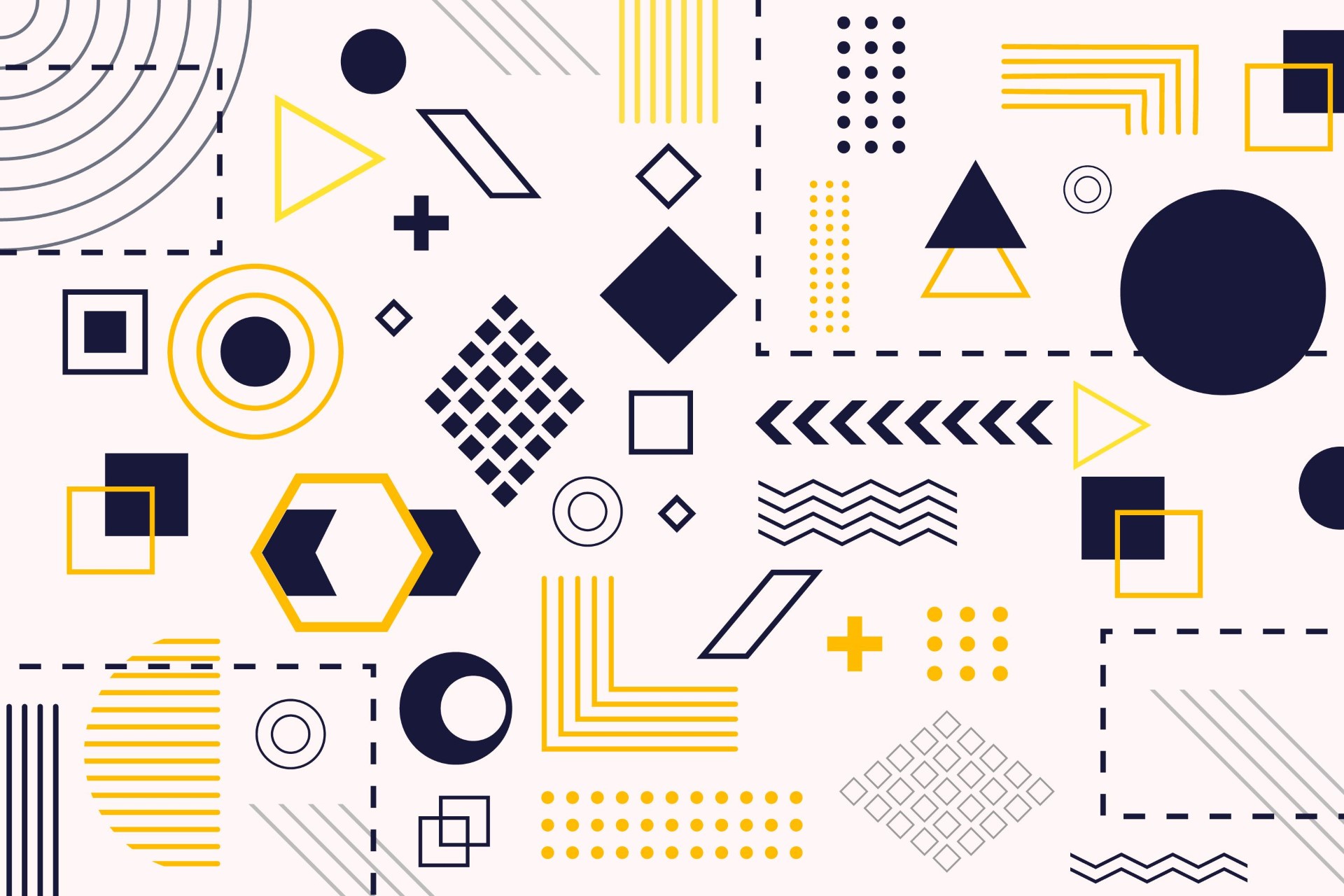
Layered Effects
Elements that stack and marge and overlap can establish connectivity between design elements and a depth effect. Layered effects can be obvious and direct or a little more understated. Both options can work together or alone for overall impact.
State Creative uses multiple layers – background, mid-, an foregrounds – to put together a variety of elements in a way that’s visually interesting and meaningful.
Typography that’s bigger and bolder
A good exercise for any web designer is to play around with typography from the git-go. No images, no graphics, just type. Sometimes, the bigger and bolder the typography, the better and longer-lasting impression a website can make. But that’s not always the case. At a certain size, words become more of a graphic element than simply copy, making typography the visual focal point of a site. Choosing a font helps set the tone for what the audience expects from the website, so it’s important to strike the right balance between size and scale.
It’s all about the linework
Toggling that nostalgia/modernist line is, wait for it, linework. Designers are using lines to delineate sections, paragraphs, headers, and product galleries on websites with more visual weight and flair. Linework is also great for creating dynamic grids for an entire webpage. In some cases, these structured lines and grids make static websites feel almost app-like.
Inclusive Design
Designers are working toward a more inclusive web and it is showing in almost everything that’s being published. From imagery to language to alt text, there’s no reason not to try to make your projects more inclusive of all people.
Inclusivity extends to race, gender neutrality, culture, accessibility, and ability. The common theme is that your website should be put together in such a way that anyone who wants to can get access to the content and people also see others who they can relate to on the screen.
The fine line here is that you don’t need to be over the top with images and language that screams “WE ARE INCLUSIVE.” This is one of those design situations where showing is more important than telling, and being true and authentic is more important than forcing it.