


In today’s digital landscape, having a mobile-friendly website is no longer an option but a necessity. With more than half of the world’s Internet traffic coming from mobile devices, businesses must prioritize creating user-friendly mobile websites. To help you achieve this, here are five valuable lessons in design aesthetics that will guide you in creating an exceptional mobile website for your brand.
1. Work On The Images
Images play a crucial role in capturing users’ attention, whether they are viewing a website on a desktop or a mobile device. It is essential to ensure that images are displayed properly to provide a positive user experience.
To make images responsive, avoid using absolute widths. Instead, scale images using the max-width property and set width: 100% for the images. It is important to maintain the correct dimensions and avoid using fixed properties.
Additionally, optimize images to ensure fast loading times and optimal quality. Utilize WordPress plugins or standalone tools to compress images and reduce unnecessary meta data while preserving image quality.
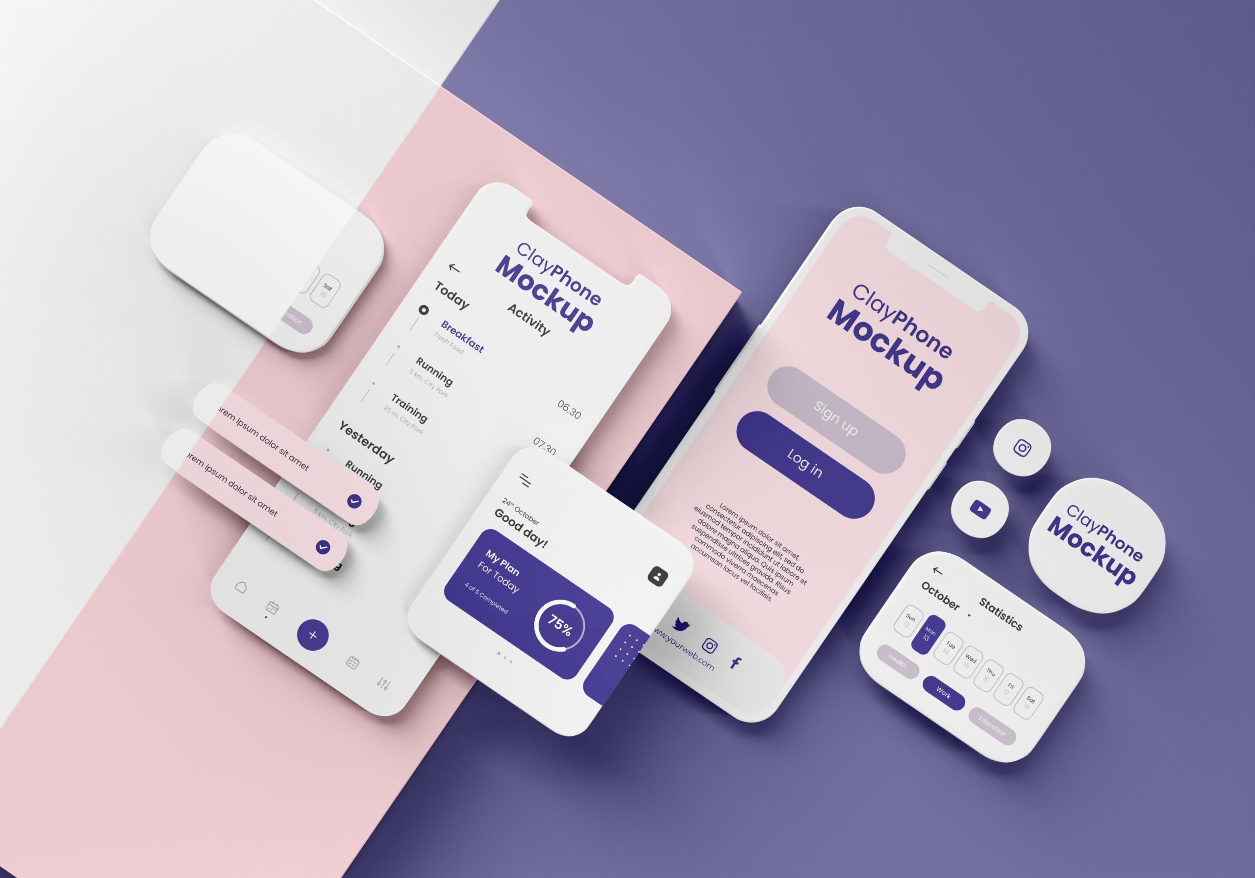
2. Play With Colors
Color is a powerful tool in a website designer’s arsenal. It can convey meaning, attract users, and create a strong brand identity. By using the right colors, you can quickly communicate information, enhance conversions, and establish consistency throughout your website.
Develop a well-thought-out color scheme that aligns with your brand. Use contrast to highlight important elements, such as products, services, and calls-to-action. Consider using a key color to indicate interactivity and different colors for non-interactive elements. Keep the color palette limited to 2-3 colors for a cohesive and visually pleasing design. Remember to choose colors that resonate with your target audience, as colors can have different meanings in various cultures.
2. Embracing Creativity in Marketing Strategies
To adapt to the changing landscape, marketers will need to unleash their creativity. With conventional data collection methods becoming less reliable, marketers must develop new strategies to meet challenges and seize opportunities. Diverse sources of user data will need to be harnessed to create engaging and tailored content that resonates with the target audience.
3. Improve Readability
Readability is crucial for delivering a positive user experience. Small screens and challenging lighting conditions pose unique challenges for mobile websites. Enhancing readability requires more than just selecting the right font style and size.
Choose sans serif fonts that are not smaller than 16 pixels for optimal readability. Consider using percentages instead of fixed heights to ensure proper scaling across different devices. Avoid low contrast, poor color combinations, and distracting background images that can hinder readability.
Implement responsive typography or fluid typography that smoothly resizes based on device width. This approach ensures that your content remains legible across various screen sizes.
4. Simplify The Navigation
Efficient navigation is essential for helping users find the information they need quickly. However, overwhelming users with too many navigation options or hiding navigation behind an icon can hinder usability.
Consider placing primary navigation at the top of the page to provide easy access. Avoid covering the entire mobile screen with navigation, as it may distract users from the main content. Explore fixed scrolling navigation bars with the ‘greedy navigation’ technique, allowing users to jump to different sections while scrolling. This approach optimizes screen space, displaying important links while hiding others behind a ‘more’ button.
Other navigation options gaining prominence include mega menus, vertical sliding navigation, and universal navigation. Choose the navigation style that best suits your website’s structure and user needs.
5. Switch To Scalable Vector Graphics (SVG)
Scalable Vector Graphics (SVGs) are powerful tools for website designers. They are lightweight files built with XML, making them flexible and easily scalable without compromising quality. SVGs are ideal for icons, illustrations, and background patterns.
As vector images, SVGs retain their quality regardless of scaling. Unlike other file formats, animated SVGs do not require additional HTTP requests, improving page load speeds. SVGs are increasingly becoming the preferred choice over traditional formats like PNG, JPG, and GIF, offering superior multimedia experiences.
In the ever-evolving digital landscape, designing a mobile website requires a different approach than designing for desktop. With these five lessons in design aesthetics, you now have valuable insights to create an exceptional mobile website that engages users and enhances their experience. Embrace these principles and adapt them to your brand’s unique identity to create a mobile website that stands out from the rest.